Sunday, February 24, 2013

Oh, the Shark, Babe, has Such Teeth, Dear...

A few years ago, I wondered what song was at the top of the Billboard Top 100 on the day I was born.   Who doesn't love Wikipedia? The answer was just a few clicks away: Bobby Darin's classic, memorable cover of Mack the Knife was dominating the charts in the fall of 1959, being in the top spot for nine weeks! Nine weeks out of ten, that is: the Fleetwoods knocked it out of the top spot for one week in November with a tune called Mr. Blue, and that was the week I was born. The Fleetwoods had another #1 hit earlier in 1959, Come Softly To Me, which has stood the test of time and is still heard today. But I had never heard Mr. Blue until I tracked it down (well, maybe I heard it over the car radio when my parents were driving me home from the hospital). Temperamentally, I'm a lot more like a Mr. Blue than a Mack the Knife (ask my wife), but still, it would have been a lot cooler to have been born under the sign of Mack the Knife.


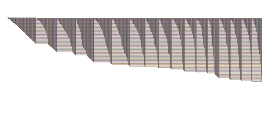
Anyway, the opening line from Mack the Knife in today's title refers to shark's teeth, and that's germane to this post because I want to call your attention to the sharp end of the stick for a BioFabric plot: the upper left-hand corner. The image below is a detail of the sharp end of the wiki-vote network I discussed in a post a few days ago:  
BioFabric Network Visualization: Wiki-Vote network: left detail
Click to enlarge image
It's always fun and informative to study that part of the network, and the eye is drawn naturally to it up there in the upper left corner. So what's going on here? (You might want to fire up the network, available here in a ZIP archive, in BioFabric to follow along with this discussion.)

Again, it is important to remember that the default layout (used here) assigns node rows using a breadth-first search of the network, starting at the node with the highest degree, and visiting neighbors in order from highest degree to lowest. So that first node wedge on the far left (node 2565is for the highest degree node (in the case of a tie, we fall back on alphabetical ordering of the names), and in this example, all the edge wedges to the right of it are for nodes that are first neighbors of 2565.

A few days ago I talked about learning to read the top bumps (a.k.a. BioFabric Phrenology), and today I want to stress the importance of learning to read edge wedges. I think that edge wedges are one of the great features of BioFabric, in that they provide a great visual representation of the connectivity of the different nodes in the network, and they make it easy to compare, in a very visual fashion, how two nodes match up in terms of their connectivity. Admittedly, the same ability is provided by comparing two columns in an adjacency matrix, but I contend that the extra visual bulk we get by drawing the edges as lines instead of as points makes the comparison easier. The edge wedges also benefit from being able to use the slope of the left side of the wedge to gather clues about the connectivity patterns.

Always remember, unless you have multiple edges between two nodes, the shallowest angle you can get from the left side of a wedge for a single node is 45 degrees. This is a byproduct of the regular, square grid used for both nodes and edge lines, and the way the layout algorithm assigns edge columns according to increasing length for a given node. So if you see a shallower wedge angle, you are either looking at a directed graph with lots of reciprocal edge pairings, or a multigraph with multiple edges between two nodes (i.e. links tagged with different edge attributes). Also, note I qualified the 45 degree statement by saying I was referring to a single node's wedge. Multiple contiguous nodes can clearly create a run of wedges that produce a shallower angle than 45 degrees on the bottom of the plot, and this is the norm: that's why bottom edge of the plot typically flattens out as we travel to the right.

The wiki-votes graph shown above is a directed graph. If you look closely at the leftmost edge wedge, you can discern that the wedge angle is a little shallower than 45 degrees at the start, but pretty close to 45 near the end. Thus, we can see that node 2565 has some reciprocal directed relationships with its high-degree first neighbors, but this falls away to one-way relationships with its low-degree neighbors. In BioFabric, you can make this guess while looking at a wide angle zoom, and quickly zoom in to confirm this hypothesis with a few keystrokes.

Doing inter-wedge comparisons is another skill to become comfortable with. For example, compare the second wedge from the left (for node 1549) with the first node 2565 wedge in the above diagram. Node 1549 clearly shares lots of 2565's high-degree neighbors, since the wedge angles are similar near the top, but this similarity drops off with 2565's low-degree neighbors, as the 1549 wedge angle becomes almost vertical. Also look at the ratio of shared and unshared edges in the 1549 wedge: we can see that about 60% of 1549's neighbors are shared with 2565 (the top/left part of the wedge), and 40% are different (the bottom/right part).

Moving further over to the right to look at the other wedges, you can get an idea of which nodes have similar connectivity by looking for similar edge wedge shapes. Note also how the 13th node from the left (4037) has a small wedge of nodes that are connected only to it, and nobody else; this pops out at you because it creates the visible small gap in the node rows. These gaps are usually pretty common, and provide a nice visual navigation aid as you move around the network.

So pay attention to the shark's teeth (babe) when looking at a BioFabric plot!
Saturday, February 23, 2013

The Shape of Things to Come

Or perhaps another reference to classic science fiction media would be The Outer Limits.  For this posting, I direct your attention to this BioFabric network:

BioFabric Stanford Web Network
Click on image to enlarge
It's another example from the Stanford Large Network Dataset Collection.  This time, it's the Stanford Web Graph.  It's pretty much what you would expect: to quote the source, "nodes represent pages from Stanford University (stanford.edu) and directed edges represent hyperlinks between them."

But the interesting thing about the network above is that it contains 281,903 nodes and 2,312,497 edges.

And it kind of blows my mind that I feel that by looking at this, I can actually start to get some inklings about what is going on (YMMV).  At a minimum, I certainly know what I want to zoom in on and start to explore; there are all sorts of interesting structures in there to poke around and look at.  And the sequential nature of the BioFabric approach means I can easily do this in a methodical fashion. With hairballs containing 2.3 million edges, it seems kinda hopeless (for me, at least) without first hacking most of the network away.

Clicking on the image above to get a "larger version" is kind of a cruel joke.  Over at the Gallery, you can grab a 11,075 x 1,350 1.6 MB PNG with insanely inadequate resolution, or a much larger 31,173 x 3,800 13.0 MB PNG that is just ludicrously, stupendously inadequate.  They both look pretty bad... there is lots of room for improvement in rendering when links are this dense.  Of course, if you were trying to print this network out on paper, with one line per millimeter, the paper would be 2.3 kilometers long, and 282 meters high.

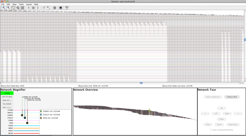
This is, of course, where the interactive BioFabric tool is supposed to come in! You can scroll around, zoom in and out, and explore a network in great detail.  After all, nobody thinks twice anymore about zooming in to look at cars and houses all over the entire world in Google Maps, right?  But, I am embarrassed to admit, this is why I referred to The Outer Limits at the start of the post... I can't do that yet at this scale. The nodes as lines technique scales wonderfully, but my implementation in software is not there yet. Version 1.0.0 is, after all, built as a proof-of-concept. Using the 4GB large memory version available on from the web site, I was able to get the network loaded, laid out, and exported to PNG, but the program was so sluggish as to be unusable as an interactive tool. Navigation was almost impossible. And when I tried to lay out the network using my similarity algorithm, the 4GB was not up to the task: I got an "out of memory" error after it ran for a few hours. So now I have a test case to use for working on the program's scalability.  But by using Jedi navigation tricks (hint: you can get a maximum zoom to the location under the mouse by pressing Ctrl-1 [that's one, not L], then zoom back out a bit), I did get a screen shot to show a detail:

BioFabric Stanford Web Network: Detail Screenshot
Click on image to enlarge

So these problems are the reason why I did not post a .bif file to the Gallery; it would be too painful.  Additionally, it would be really big: since that format is XML (more lack of scalability!), the file is about 750MB uncompressed, and 70MB in a ZIP.  If you insist, you can go get the original file from the source and create your own .sif import by deleting a few lines at the start and using awk to format it. You can get it to import if you let it run overnight, but it's just too embarrassing right now for me to make it too easy to do this.

One last point: I really found it frustrating that the data set is anonymized!  When you can actually see all sorts of interesting patterns in the network (why are there 21 pages with what looks to be essentially identical sets of links, as shown above?) you kinda want to try to figure out why that is.

So, truth be told, this network mostly serves to give an idea of the challenges ahead for BioFabric. But I'm looking forward to the day when I can easily explore this network (and larger) in depth: the picture at the top is The Shape of Things to Come!

Thursday, February 21, 2013

BioFabric Phrenology

The previous post of the small network from Les Miserables hopefully helped to get people more comfortable with thinking about nodes as horizontal lines. Keep exploring it until the concept starts to become second nature! But today's example is more typical of the types of networks BioFabric has to deal with. It is an example from the Stanford Large Network Dataset Collection: Wikipedia voting patterns. This network is available here, and is a directed graph weighing in at 7115 nodes and 103689 edges. To quote the page, "Nodes in the network represent wikipedia users and a directed edge from node i to node j represents that user i voted on user j."  Here it is, in the typical BioFabric high-aspect ratio presentation:


BioFabric Network Visualization
Click on image to enlarge

Click on the image above to get a somewhat larger version (1024 x 82 pixels).  Like the Les Miserables example, it is posted in the BioFabric Gallery, where you can get a 4 MB 10300 x 826 pixel PNG (which is actually still pretty low resolution) , as well as a 3.1 MB ZIP archive of the .bif file.

When I first looked at this network, one interesting feature quickly popped out at me.  Looking about 75% of the way across on the top edge (going left to right), you can see a bump. This close-up detail of that part of the network shows it clearly:

BioFabric Network Visualization: BioFabric Phrenology!
Click on image to enlarge

This marks the end of what I'll call the "first neighbor bump".  These distinctive bumps along the top edge of the network (there are more to the right of the one shown above) are a feature of the default layout algorithm used to draw this network; this algorithm is described in the BioFabric paper. Briefly, this layout assigns node rows using a breadth-first search of the network, starting at the node with the highest degree, and visiting neighbors in order from highest degree to lowest. Because we finish laying out the last lowest-degree neighbors of the starting node #1 just before we jump to start laying out the remaining unvisited high-degree neighbors of node #2, we typically get the bump shown above. So the prominent "edge wedge" just to the right of the discontinuity contains the previously untraversed edges incident on the first node that is two hops away from the start. (Keep in mind that edges incident on this first two-hop node that connect to nodes one hop from the start were already traversed and laid out somewhere on the left.) So the nodes laid out above this node line are all only one hop away from the starting node; the nodes laid out on or below this node line are at least two hops from the start.  This also means that the edges to the left of the discontinuity are originating either from the starting node, or one of the first neighbors.

So this is what popped out at me: the starting node and its first neighbors represent about 10% of the nodes in the network (which I can eyeball by comparing the height of this first bump to the total height of the network).  Yet the edges incident on these nodes account for about 75% of the total edges in the network (based on the placement of the end of this "first neighbor bump")!  An important fact about this large network with over 100000 edges comes almost for free.

I find these bumps help me to navigate and think about the network, and the fact that everything is laid out on a regular grid means that these features can help you to quickly estimate percentages as well.  So start to get tuned in to interpreting the bumps on the top of the network: "BioFabric phrenology"!

Wednesday, February 20, 2013

A Network Classic: Les Miserables


The co-appearance network of characters from Victor Hugo's novel Les Miserables, from D. E. Knuth, The Stanford GraphBase: A Platform for Combinatorial Computing, Addison-Wesley, Reading, MA (1993), is a classic example network.  It is certainly commonly used: for example, hereherehereherehereherehereherehere, and here!  Those links lead to a variety of different visualizations, including adjacency matrices, arc diagrams, and many node-link diagrams with different types of layouts.  So as a first example, I have created a BioFabric version of that network, shown in this thumbnail:

BioFabric Network Visualization: Les Miserables
Click on image to enlarge

Click on the thumbnail above to view the network, or go take a look at the much larger version available at the newly-created BioFabric Gallery.  Even better, you can get the BioFabric .bif file from the Gallery as well and load it into BioFabric to explore the network interactively.  For while this network may be small enough to make it practical to use just a static image, the interactive viewer is really essential as networks grow in size.  And I can't stress enough how important interactivity is with BioFabric!  Being able to pan over the entire network, and zoom in to view interesting features, is a key aspect of the working with a BioFabric network.

The GML file for this network that is available from the Gephi Datasets Wiki includes cluster assignments for the nodes, and these have been used to create the clustered layout shown above.  Note the following things about this layout:
  • The clustered layout technique used above is not yet built into BioFabric Version 1.0.0, so the ordering of node rows and edge columns was calculated externally, then imported.  Getting this technique built into the program is high on the list of planned enhancements. 
  • The clusters were ordered from top to bottom according to the number of nodes in each cluster.
  • Each cluster was first laid out separately using just the intra-cluster edges and the default breadth-first search technique. The inter-cluster edges were then added, and assigned to columns so that connections between clusters are visually distinct from the edges within each cluster.   There was then a final step of manual tweaking to fine tune the layout.
  • There are several cliques in this network, e.g. the Fantine and most of the Marius clusters, and they stand out in this layout as a series of adjacent edge wedges of steadily decreasing size.
So there is now yet another way to look at this venerable network example!  If you have any questions, please add them in the comments.

Tuesday, February 19, 2013

Let's Get Started

This blog will provide a running commentary on developments in BioFabric, which is a new network visualization tool that takes a different approach: instead of using points to represent nodes in the traditional node-link presentation, nodes are represented by lines!  This opens up a whole new way of looking at networks... a way that avoids the scalability limitation that leads to network hairballs.
Since the best way to learn about how to understand and use BioFabric is to look at lots of networks, that will be the goal of this blog.  I'll post my first example soon, but you can get started by visiting the project website at www.BioFabric.org, and by reading the paper in BMC Bioinformatics.