Saturday, April 27, 2013

National Hairball Awareness Day

I'm new to this game, so I missed the importance of yesterday, the last Friday in April. Apparently, it was National Hairball Awareness Day!

OK, it was for cats, but who can afford to be picky? I'm going to appropriate the day to refer to bad network visualizations as well. On National Hairball Awareness Day, tell everybody you know about BioFabric!  The cure for this awful affliction is in our grasp, we just need to use it!

I'm still working on my next World Bank network post; it will be along soon...

Sunday, April 21, 2013

Strange Interlude


This post continues to discuss the World Bank Major Contract Awards network that I introduced in this blog post. But since I'm about to introduce a submodel for Niger and use it to describe how the per-country links of the World Bank model are organized, it seems like a good time to take a brief detour (a Strange Interlude?) and provide a quick tutorial on how to build such a submodel. Obviously, when dealing with a large network, you need to be able to look at subgraphs in isolation, and BioFabric provides this capability. (N.B. Version 1.0.0 currently supports only one submodel view; the long-term plan is to support a model hierarchy like the one provided by BioFabric's older brother BioTapestry.) 

Start by loading up the full network into BioFabric:

BioFabric Screenshot #1: Creating a Submodel
Click to enlarge picture

A submodel is built by first selecting some set of nodes and associated edges in the main network. There are several ways to select things, e.g. clicking on node rows, but for this quick example I will just use the search function to find and select Niger. Start by clicking on the Search for Nodes... button on the toolbar:

BioFabric Screenshot #2: Creating a Submodel
Click to enlarge picture

This causes the search dialog to pop up. Type Niger into the text box, and keep the setting at Match full name; otherwise your search results will also include e.g. Nigeria:


BioFabric Screenshot #3: Creating a Submodel
Click to enlarge picture

Click Search in the dialog, and the view will zoom into the left-end label of the Niger node row, with the node label highlighted with the orange selection circle:

BioFabric Screenshot #4: Creating a Submodel
Click to enlarge picture

What we want to do is create a submodel that includes all the first neighbors of Niger, as well as the edges to those neighbors. This step is easy; you just click on the Add First Neighbors to Selection button on the toolbar:

BioFabric Screenshot #5: Creating a Submodel
Click to enlarge picture

If you zoom out a bit and (PC) Ctrl- or (Mac) Command- mouse drag over to the right, you will see Niger and all its incident links selected:

BioFabric Screenshot #6: Creating a Submodel
Click to enlarge picture

Now, click on the Send Selections to Subset View button on the toolbar:

BioFabric Screenshot #7: Creating a Submodel
Click to enlarge picture

And the subset view of Niger and its first neighbors shows up in a new window, so you can now study the submodel in detail, as the neighbor nodes at the very bottom have been brought up right under the other nodes:

BioFabric Screenshot #8: Creating a Submodel
Click to enlarge picture

Notably, the precise row-and column ordering of a BioFabric network allows the subgraph to share exactly the same ordering of nodes and edges as the main network. The only difference is the unused rows and columns of the main graph are compressed out of the subgraph view. In fact, that's why the "global player" nodes at the bottom extend out to the far left of the submodel, because those node lines originated in columns to the left of the Niger node in the main network view. The submodel layout compresses out unused columns, but never changes the ordering of the network elements.

That's all there is to creating a submodel view! In the next posting, I will use this Niger submodel to focus in on, and discuss, the small-scale organization of the model edges.

Saturday, April 13, 2013

The Ongoing Contemplation of Entangled Banks


Let's continue the discussion of the World Bank Major Contract Award network that I introduced in my last blog post.

To recap, the network is from a database of contract awards, where each row in the database creates an edge that is basically of the form (Borrower Country)  --> (Supplier Country:Supplier), and so the network nodes are either borrower countries or suppliers. By my count, there are 156 borrower "countries", though that group includes supranational entities like "Africa", "South Asia", "East Africa and Pacific", and even "World". All the rest of the 44,213 nodes are thus suppliers. Here's the 30,000 foot BioFabric view of the whole network:

World Bank Major Contract Awards 2007-2013: BioFabric
Click on image to enlarge


And here again is a close-up of looking at one wedge, for the country Niger:


Niger Screenshot, World Bank Major Contract Awards 2007-2013: BioFabric
Click on image to enlarge


There are a few important observations we can make about the nodes:

  1. A large fraction of the suppliers only show up once in the database. In terms of the network, that means those supplier nodes have degree one, with only one inbound edge. In terms of the BioFabric version, it means there is no visible node line for those nodes. The inbound edge terminates at the end glyph on the node's assigned row, and the node label is shown, but there does not have to be a line drawn. Thus, the network as a whole is mostly devoid of node lines.
  2. For those suppliers who do have multiple inbound edges, almost all of those are suppliers to a single borrower country. The net result of this fact, combined with the preceding one, is that for each borrower country, the great majority of attached nodes are exclusive to that country. From the BioFabric perspective, each of the 156 borrower countries has its own separate edge wedge, and those wedges are mostly self-contained communities consisting of the borrower country and its exclusive suppliers.
  3. Among the suppliers, there are some "global players" who have one or more contracts with more than one country. In the BioFabric network, these global players show up at the very bottom of the view, with node lines that span a good fraction of the width of the network. It turns out that almost every borrower country has some contracts to these global players, and it is these edges that appear as the long vertical "umbilical cord" leading down from each borrower to the common substrate of these global suppliers.

Note that I said that "almost every" borrower country has contracts with the global players. How many don't? That's pretty easy to answer with just the scrollbar and Ctrl-mouse drags (Command-mouse drags on the Mac) when viewing the model in BioFabric: I count 13 countries that don't link to the global players. Almost all these are the tiny wedges right near the lower right. The biggest wedge meeting this description is Bolivia, which you can spot with the naked eye even in the low-resolution global view above (after you click to enlarge!). It is about 70% across, going left to right.

User Tip: By the way, Ctrl-mouse drags, or Command-mouse drags on the Mac, are essential navigation tools!  With really big networks, the scroll bars become too sensitive to be really useful when you are zoomed in.  But those mouse drags while holding down the Ctrl or Command keys are always useful and scale-appropriate.

The network is drawn using a custom layout that was created simply by specifying a special node-row ordering. The country nodes were ordered, top to bottom, by decreasing degree, which is why the wedges get smaller as you go from top to bottom. Immediately below each country node, the supplier nodes exclusive to that country were laid out. Finally, the global supplier nodes were assigned to the bottom rows, again according to decreasing degree.

Thus, we have the distinctive shape of the network, and actually an immediate optimization leaps to mind. Since the country wedges are completely independent above the shared global substrate at the bottom, we could collapse the vertical dimension of the network by reusing node rows across countries. In other words, the long umbilicals could all be eliminated, with all the country wedges sitting directly over the shared global nodes. The current version of BioFabric can't do that, since it is hardwired to provide every node in the network with an exclusively assigned row, even if the node has degree one and does not require an explicitly drawn node line. This is what results in the stair-step appearance, since each of the 44,213 nodes goes into its own row. It's an interesting possibility for a future enhancement to allow for sharing node rows, but I am of two minds about this, since it removes the iron-clad "one node per row" rule in favor of a more compact, but more ambiguous representation. I'm also pondering the possibility, and advisability, of allowing edge column sharing as well. But the fact is, the first BioFabric prototypes allowed for this sharing in an attempt to compress the representation, and the results were confusing, not compelling. But this network is an example of a special case where the reverse may be true, so perhaps the feature should be allowed, but not encouraged?

Also, I mentioned above that this custom layout only required that I specify the node order. In fact, it seems to frequently be the case that the default edge-drawing algorithm does perfectly well creating a good custom layout after only needing to specify the node order.

That's it for tonight. I've tried to describe the logic behind the large-level structure of the BioFabric version of the network. The next installment will dive in and look at the detailed properties of the edge wedges, and what they can tell us about each borrower country!

Thursday, April 11, 2013

It is Interesting to Contemplate an Entangled Bank...

When Charles Darwin wrote that line in The Origin of Species (1859), he was talking about a landscape feature:
"It is interesting to contemplate an entangled bank, clothed with many plants of many kinds, with birds singing on the bushes, with various insects flitting about, and with worms crawling through the damp earth, and to reflect that these elaborately constructed forms, so different from each other, and dependent on each other in so complex a manner, have all been produced by laws acting around us."
Unfortunately, that is as close to biology as we are going to get in this next series of blog postings, since the BioFabric network I am about to cover is actually about another bank: the World Bank, established in 1944 at the Bretton Woods Conference, and whose "...official goal is the reduction of poverty."

Why am I working with a network from the World Bank? Well, the Guardian, Google, and the Open Knowledge Foundation announced a competition in February to visualize "...an open dataset from any government open data website". But I ran across this link in late March, and the contest was ending on April 2nd. So after a brief and admittedly desultory search through their list of open data websites, trying to find a compelling network data set, I decided to bag it.

But then, almost immediately after, I ran across the "World Bank Global Development Sprint" being hosted at visualizing.org. Apparently also triggered by the February push to raise the profile of open government data, this effort is working to build a collaborative web-based network visualization of a data set of World Bank Major Contract Awards.

Go take a look at the site. What they have been creating is well-crafted, visually stunning, and fun to watch, but it uses the traditional node-link diagram approach with nodes-as-points. I was not feeling that I was getting deep insights into the data set, and I was wondering what I could do with the data in BioFabric to find interesting patterns. So my interest was piqued, and this gave me the kick I needed. I went to the World Bank site, downloaded the data, and started playing with it.

As mentioned above, this is a network visualization of the World Bank Major Contract Awards for fiscal years 2007-2013. The network consists of 44,213 nodes and 66,021 edges. Each edge corresponds to a row in the data table on the World Bank site, though three apparent duplicate rows have been dropped. Each contract row thus creates a edge that is basically of the form (Borrower Country)  --> (Supplier Country:Supplier); network nodes are either countries or suppliers. Basically, we get to see what countries are borrowing from the World Bank, and who is getting the contracts from each country. Additionally, since each supplier node is also tagged with the supplier country, we get to see what countries the contracts are going to. I'll go into lots more details in subsequent blog posts.

To get started, here is the full network view, followed by a screen shot of BioFabric looking at the contract wedge for Niger. I'll be the first to admit that it looks pretty uninspiring compared to the snazzy version over at visualizing.org, but I think it offers an exciting way to deeply and systematically probe the data set:

World Bank Major Contract Awards 2007-2013: BioFabric
Click on picture to enlarge

World Bank Major Contract Awards 2007-2013: BioFabric Screenshot
Click on picture to enlarge

Some higher resolution network snapshots, the BioFabric .bif file, and links to the data sources are now up on the BioFabric Gallery. As with other networks, the best way to look at them is by loading the .bif file into BioFabric and then go exploring.

That's it for this introductory post. In my next posts, I'll talk much more about the details of this network. So get ready to go and "contemplate an entangled bank"!

Saturday, April 6, 2013

Northwest Nirvana Nursery?

Ben Shneiderman is one of the grand viziers of  visualization (does this make him a visviz?). He and Cody Dunne proposed, in a research report (C. Dunne and B. Shneiderman, “Improving graph drawing readability by incorporating readability metrics: A software tool for network analysts,” University of Maryland, HCIL Tech Report HCIL-2009-13, May 2009), a set of guidelines they called NetViz Nirvana. You can see Prof. Shneiderman talk about this at the Graph Drawing 2012 conference in an online video.

So what is NetViz Nirvana? They suggest that people creating a network visualization should "aspire to these four principles", as listed in the report:
  • Every node is visible
  • For every node you can count its degree
  • For every edge you can follow it from source to destination
  • Clusters and outliers are identifiable
So how does BioFabric stack up against these four principles?  Let's have a look!

Every Node is Visible
BioFabric passes this test. Every node is a line that is assigned to a unique row, so by definition two nodes cannot obscure each other. Furthermore, with the default layout at least, you are also guaranteed to be able to read the node name label over at the far left end of the node line.  Take a look:
Valjean, Gavroche, and Marius
Click on picture to enlarge

You could perhaps argue that nodes are being hidden behind the edges, but in fact, the majority of the node line will always be visible thanks to the fixed spacing between the edges. Finally, the square glyphs clearly highlighting the end of each edge incident on a node serve as a guarantee that the node cannot be considered invisible. So what's the Nirvana score so far? 1 of 1. Off to a good start!

For Every Node You Can Count its Degree
With BioFabric's normal presentation mode, you could argue that counting a node's degree could get difficult, since the edges can be distributed anywhere along the node line. But it is true that you are guaranteed to be able to count this number, as each incident edge has a unique, unambiguous, unobscured glyph located somewhere on the node line.

But if that answer is not good enough, we can turn to BioFabric's shadow link mode, which I described in a couple of previous postings here and here. When you use shadow links, you can see all the edges incident on a node in a single contiguous stretch of a node line. Quick, what is Joly's degree in the network below?

What is Joly's degree?
Click on picture to enlarge
Count 'em: 12. What's more, the nodes above in the stretch around Joly were arranged left-to-right by degree, so I can immediately say that Bahorel, to Joly's left, has degree >= 12 (it's actually 12), and Combeferre, on the right, has degree <= 12 (it's actually 11).

In a traditional node-link diagram, with nodes as points, you can easily imagine a situation where so many edges are converging on a high-degree node that you end up looking at a solid blob of ink surrounding the node. But with BioFabric, incident edges are guaranteed their own little bit of elbow room.  So BioFabric's current Nirvana score is now 2 out of 2. It's looking promising!

For Every Edge You Can Follow it From Source to Destination
I think this principle is clearly the killer for the traditional node-link diagrams when the network starts to get large. Edge intersections and edge "tunneling" (edges passing under a node) can make it very hard to accomplish this task in a crowded network visualization. But BioFabric does not suffer from those problems. Edges can never intersect, again by definition, and the intersections of edges with nodes is so formalized, uniform, and regular as to be totally unambiguous. The presence of the distinctive glyph is what marks the source and destination of an edge, and following an edge is as simple as looking straight up or down on the page to find the associated glyph. Nirvana score? 3 of 3!

Clusters and Outliers are Identifiable 
Network layout in BioFabric is simply a linear ordering of the node rows and another linear ordering of the edge columns. If we are going to be able to identify clusters, we will need to build a layout that groups the nodes and edges of a cluster together into contiguous sets. I keep showing the Les Miserables network over and over, but I think it does a good job of showing how BioFabric can make it easy to pick out clusters in a network:

BioFabric Version of Knuth's Les Miserables Network (Clustered)
Click on picture to enlarge

As for outliers, assigning outlier nodes to the very bottom rows can make those stand out as well. The nodes that are assigned to the bottommost rows when the default layout is applied to the same network illustrate this principle:

BioFabric Version of Knuth's Les Miserables Network (Default Layout)
Click on picture to enlarge

If we wanted to have the nodes only attached to Valjean stand out in a similar fashion, we could have created a custom layout that moved those node rows to the bottom as well.

As I have stressed in previous posts, a clustered layout algorithm is not yet built into BioFabric, but such a layout can be specified by importing node row and and edge column assignments as attribute files.

Personally, I feel that BioFabric provides a great way to visualize clusters, and is better than other existing approaches. So I feel completely justified in awarding the last remaining Nirvana point. Final NetViz Nirvana score for BioFabric: 4 out of 4. 100%!

Northwest Nirvana Nursery?
So can the U.S. Pacific Northwest be called a Nirvana Nursery? It is certainly famous for being the birthplace of the grunge band Nirvana, which emerged from Aberdeen, Washington in the late 1980's. Has Seattle-born BioFabric perhaps achieved some small measure of [NetViz] Nirvana in its own right?

Thursday, April 4, 2013

An Ode to the Node

BioFabric is all about giving network edges the recognition they deserve in network visualizations. Traditional node-link diagrams are happy to pile edges all on top of each other willy-nilly, thereby making individual edges impossible to trace. The innovation of edge bundling spruces things up quite a bit, but that approach is happy to pile all the edges on top of each other in a clean, well-planned, organized fashion... thereby making individual edges impossible to trace. And while adjacency matrices do put the edges front and center, they manage to do so by depicting the edges basically as itsy-bitsy little points; I happen to think that each edge deserve more ink than that. I like my network edges with some meat on their bones.

Yet while BioFabric gives edges the center stage, it still gives nodes their due as well, drawing them as horizontal lines lurking behind the edge wedges. But I thought my credentials as a real edge fanatic were solid, until I was recently asked an interesting question: why bother to show the nodes at all in a BioFabric network?
What's the point of all those horizontal lines, anyway?
The flippant answer to that question is that of course you need show them: they are, after all, the nodes in a node-link diagram of a network! But of course, it is a general rule that you don't want to add ink to your visualization unless it serves a purpose, and so it is indeed a valid question that deserves some serious thought... so should we just ditch the node lines entirely and let the edge wedges do all the talking? Maybe turn-about is fair play, and we should let the nodes take it on the chin for once after hogging the limelight for so long?

There is no question that by drawing in the nodes, we are creating a ginormous number of line intersections; this adds significantly to the visual complexity of the presentation. If no node lines were drawn, there would be no intersections at all, and a much cleaner view. And maybe since you really have no business exploring a large network unless you are using an interactive software tool, perhaps the edge wedges provide enough information all by themselves, and mousing over the links to find out the node names would be sufficient.

So what are the benefits of explicitly depicting the nodes? I can think of a few. First, one could argue that a BioFabric visualization is already somewhat more abstract than the traditional nodes-as-points depiction of the network. It is asking people to stop thinking of nodes as compact, individual entities, and instead to think of them as something a little more removed from common experience. Joe is no longer that nice round little circle over there, he is now a line on the plane. So I can argue that having Joe entirely disappear from the visualization might be a bridge too far, and will make it even harder for people to gain an intuitive understanding of what they are looking at.

Secondly, I happen to feel that the node lines provide a very useful implicit coordinate grid that helps the eye to trace horizontally across the network over long distances, while maintaining a sense of context. I find this can help a lot when I am scanning to find common link endings. As an aside, I contend that the color cycling BioFabric uses to draw links and edges is what makes it possible to maintain context while eyeballing across long distances. For this reason, the user cannot assign colors to nodes and links in BioFabric to convey additional information about them, and that is not a bug, but a feature.

Furthermore, it is true that a BioFabric network can easily create a situation where there are 100 million line intersections being shown. But I think the current implementation has served as a proof of concept to demonstrate that it is possible for the user to simply ignore the highly repetitive (fabric-like!) pattern this creates, and hone in on the important stuff that contrasts with this repetitive background. Perhaps a parallel situation is where people have no problem working with plots that are drawn on engineering graph paper with a one millimeter grid pattern?

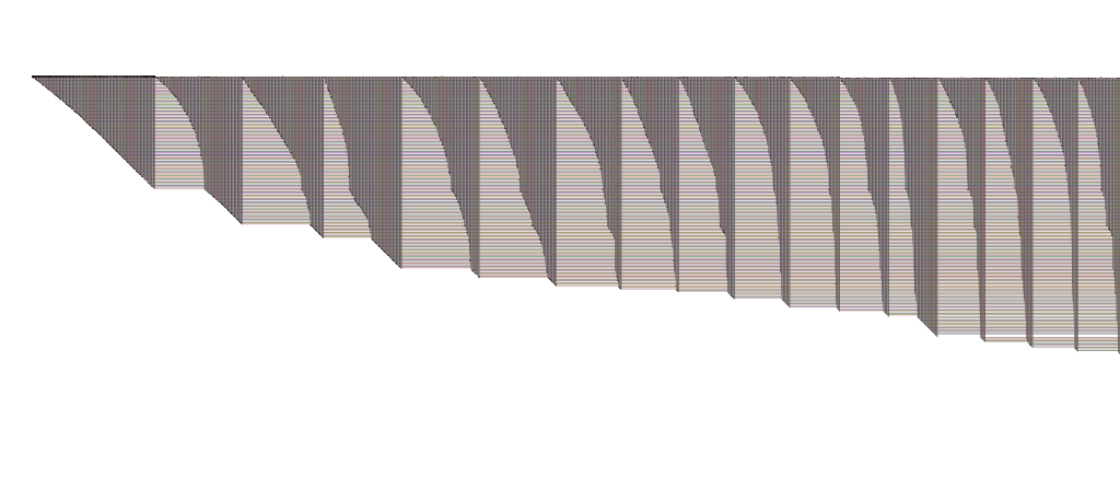
Finally, the presence or absence of a node line passing through a link end in BioFabric is a crucial piece of information, because there is an underlying rule that nodes lines "are only as long as they have to be". To understand this, consider this detail from our old standby example, the Les Miserables network:

                        Simplice and Valjean

For example, the fact that Simplice has a node line emerging from the Valjean-Simplice link end and disappearing off to the right immediately tells us that she is not a one-degree node, but has other links as well that we cannot see.  Compare this to e.g. Labarre and Gervais, who we know for certain only have links to Valjean. We can tell this because nodes are only drawn as long as needed, so nodes with no other connections have the shortest line possible, which is none at all. This line of thinking extends to higher-degree nodes as well, since we can say that when a node line ends, no further connections will appear. Of course, if we were not drawing nodes, we could infer nothing at all about the existence of additional links due to the lack of a node line.

On balance, I think the scales tip in favor of rendering nodes, with one caveat: when the network is drawn at very small scales (i.e. zoomed out to show distant, global views) it might make sense to drop the rendering of nodes. This is because BioFabric rendering has not been optimized to take into account the zoom level, and currently zoomed-out renderings need some work to improve the brightness and contrast of large full-network images. At large distances, the advantage of showing nodes decreases, and they just tend to reduce the contrast of the network image.

By the way, I was asked this interesting question about maybe not showing nodes during a busy poster session, and unfortunately I cannot properly thank that person or give them appropriate credit here for getting me to think about this question... but I do want to thank you!

I'm glad that we are knocking nodes off the pedestal a bit here, but I'm not yet ready to toss them in the rubbish bin. So I'm always going on about how (nodes == lines) -> !hairballs, but perhaps I will need to sometimes change my tune to (nodes == null) -> !hairballs?

What do you think?