Tuesday, March 26, 2013

Petite rue Picpus, No. 62 (On Becoming a Domain Expert)

In a recent post, I used Mother Innocent as an example to demonstrate how shadow links are a way to show a complete inventory of links incident on a node, and also to insure that each node has a presence on the main diagonal of a BioFabric graph:
 
Mother Innocent on the Diagonal (BioFabric)
Click on image to enlarge

Though a node named Mother Innocent may seem a little strange, it all makes sense when you know that she is a character in Victor Hugo's famed novel Les Miserables, and the network is Knuth's well-known graph of character occurrences in that novel [D. E. Knuth, The Stanford GraphBase: A Platform for Combinatorial Computing, Addison-Wesley, Reading, MA (1993)]. 

If you go back and read that post, I talked about the links between Valjean, Faucheleven, and Mother Innocent. But when I speculated on the latter's popularity and residence, I was coming from a position of (almost) complete ignorance about the actual domain that is modeled by the network. Since I had a conference trip coming up (go take a look at my posters!), I figured that the 1194-page novel (Julie Rose translation) was a great way to pass the travel time.  Plus, it allows me to conduct a little experiment. When I first played with the graph data and ran it through the various BioFabric layout alternatives, I was completely in the dark, but I could start to get a feel for the data and how the characters might interact. Now, by the time I get to the end of Hugo's novel, I will be enough of a domain expert to be able to look at the data with a different set of eyes.

As of this moment, I am only on page 480. And Hugo famously went off on tangents in this novel: Adam Gopnik, in the book introduction, refers to them as "the gassy bits", the parts that are in contrast to the dramatic sections of the novel.  In fact, I've just waded through 36 pages discussing the details of convent life and how monasticism was an anachronism in the modern world of the mid-19th century. But even with that, it's been a great read.

But I have covered enough ground to be able to say with authority that [SPOILERS AHEAD] Mother Innocent indeed had a home. She lived in the Convent of the Bernadines of Perpetual Admiration, at No. 62 petite rue Picpus, Paris. Few of the nuns interacted with the outside world, but Mother Innocent (aka Mademoiselle de Bleumeur) was the prioress, and therefore was the one who could talk with Faucheleven (the convent's gardener) and the soon-to-be assistant gardener Valjean. This discussion took place because Jean Valjean was not buried alive in the supposedly empty coffin in Vaugirard Cemetery. And I might argue that there should be a link between Gribier and Valjean in the network, since the former was quite stubbornly (albeit unknowingly) trying to accomplish the live-burial of the latter.

So, although I've recently been spotty with BioFabric postings due to travel, I've been putting my spare time to good use: reading an 1862 French novel to further the cause of network visualization.

Interesting side note: I seem to have cornered the market on image searches for "Mother Innocent" (in quotes). Go take a look: Google Image Search

Thursday, March 21, 2013

Broaden Your Thinking: Equal Rights for Edges!

I'm blogging to you today from the Broad Institute in Cambridge Massachusetts. I'm at the VIZBI 2013 conference, where I have two posters to spread the word that network edges should not be second-class citizens! They are both posted online, so go take a look. I presented the science one yesterday, and the Art and Biology one will be on display tonight. The online version of the latter is particularly nice, since you can zoom all the way in and read the node names.

Tuesday, March 12, 2013

Lamont Cranston Gives Mother Innocent a Home

In the last installment of our exciting radio drama, we learned that I was innocently occupied absorbing blatant Madison Avenue attempts to get me to nag my Mom and Dad to buy a brand-new RCA color TV, whilst said parents were happily enjoying the nostalgia of listening to The Shadow in the other room. Fans of The Shadow were well aware that perhaps the most famous identity our hero used to conceal himself was that of Lamont Cranston, a "wealthy young man about town."

This posting will talk about an important superpower possessed by Lamont, err... I mean the Shadow, umm... I mean BioFabric shadow links.  I introduced shadow links in my last posting, so if this is making even less sense than usual, go check that out first. But with that intro under our belts, let's pick up and continue working with the Les Miserables network from last time. Here it is again, in the non-shadow, default layout version:


BioFabric Network Visualization: default layout of Les Miserables network
Click on picture to enlarge 

It almost seems as if Lamont could be a name that shows up in the network along with Valjean, Gervais, and Labarre, but unfortunately he is not in there. Someone who is present, however, is Mother Innocent. She shows up over on the left near the bottom of Valjean's edge wedge.  Here is a close-up:

Mother Innocent in the BioFabric Les Miserables network
Click on picture to enlarge

One important feature of BioFabric node lines is that they are only as long as they have to be to get the job done. The node line starts when the first incident link is drawn, and ends once the last link is drawn.  This feature is actually what gives the non-shadow version of the network its distinctive shape. 

So, it turns out that Mother Innocent is not that popular. (Or maybe she is? I have not read the book, nor seen the play or the movie.)  She has only two connections in the network: one on the left end with Valjean, as shown above, and one with Fauchelevent, as shown below. The following detail shows the right end of Mother Innocent's node line. That's Mother Innocent's node line coming to an end in the lower right of the figure, after having the link to Fauchelevent laid down. She doesn't get to have her name in lights over there on the right edge, because she expires before she gets there:

Mother Innocent in BioFabric Les Miserables network: no shadow links
Click on picture to enlarge

So this is something to keep in mind when looking at a default layout BioFabric plot without shadow links: not every node ends up having a presence on the right/upper edge.  If it turns out that a node does not have any links to another node that has not yet been seen in the breadth-first search layout, the node line will quietly disappear before it shows up on the right/upper edge. Of course, that is also true of all those nodes with only one link; see e.g. Gervais, Isabeau, and Labarre in the top detail. But it can be easy to forget in the case of nodes with two or more incident links. Without shadow links, you will get empty row gaps on the right edge instead of a dedicated labeled "node zone".

So what happens when you introduce shadow links? Well, every node now gets a home on the main diagonal. That's because even though the "real" links got drawn somewhere over on the left, the shadow links, by design, are drawn as part of the dedicated node zone that appears on the diagonal. Below we show Mother Innocent's node zone in the shadow link version: she does not have any new "real" links (i.e. below the diagonal) to offer, but her links to Valjean and Fauchelevent show up as shadow links above the diagonal:

Mother Innocent in BioFabric Les Miserables network: with shadow links
Click on picture to enlarge

And note that all the other one-link worthies I mentioned above (Gervais, Isabeau, and Labarre) also appear here on the diagonal. So this is another compelling reason to get comfortable toggling to the shadow link display: it guarantees that by scanning along the main diagonal you will be sure to encounter the entire inventory of nodes.

So, just remember this important superpower of The Shadow Links, because Lamont Cranston can indeed insure that Mother Innocent has a home!

Thursday, March 7, 2013

The Shadow Knows!

"Who knows what evil lurks in the hearts of men? The Shadow knows!" So begins the popular radio drama The Shadow that ran from 1930 until 1954. When I was a tiny kid in the early '60s, the local radio station would rerun episodes on Sunday nights, much to my parent's delight. Of course, the mystery of The Shadow was lost on me, since I just wanted to go and watch Walt Disney's The Wonderful World of Color on TV!


Although the Shadow had "...the power to cloud men's minds so they cannot see him", an important feature of BioFabric, called shadow links, are intended to makes things clearer instead of cloudier.  So today's posting will provide a short introduction to get you started with shadow links.


The Les Miserables network I debuted in an earlier posting serves as a nice, compact example. But this time, I will present it with the default layout, which is how it would look after you first imported it from a .sif file. You might want to go back to the earlier posting to compare this version with the custom cluster-based layout:

BioFabric Network Visualization: Les Miserables
Click on picture to enlarge

Remember, Valjean gets top billing in the default layout because he is the highest degree node, and all of the links incident on Valjean get drawn before we move on the the highest-degree neighbor, Gavroche. Then, when we are done with Gavroche, all the remaining links incident on that node have been drawn as well. This means that when we get to e.g. the fifth node, Thenardier, the edge wedge we see for that node is not a complete inventory of all the links incident upon it, but is missing the four previous links attaching Thenardier to Valjean, Gavroche, Marius, and Javert. This is to be expected, since if we are drawing each link only once, we are not going to get a contiguous region of incident edges appearing for every node in the network: down that path lies the dread hairball. 

Given the distributed nature of drawing links that is a natural outcome of treating nodes as potentially infinitely long lines, is there a solution? Yes, and that's what the Shadow knows! Instead of drawing each link only once, we draw it twice: one "real" link, and one "shadow" link.

When BioFabric is first started, shadow links are turned off.  To see them, go to the main menu and select Edit->Set Display Options...:

Step one to add shadow links in BioFabric
Click on picture to enlarge

In the dialog box that appears, check all three middle boxes, providing shadow links, minimal submodel links, and node zone shading.  Click OK:

Step two to add shadow links in BioFabric
Click on picture to enlarge


The result adds shadow links to the network, as well as providing alternating subtle shading of the node zones to make the links belonging to each node stand out more distinctly:

Les Miserables network with shadow links
Click on picture to enlarge
Compare this shadow version with the one at the top of this posting.  See how the part of the network below the main diagonal just looks like a stretched version of the non-shadow network? In fact, all the links below the diagonal are the "real" links, while the ones above the diagonal are the duplicate "shadow" links. And since there are now twice as many links in the network, the network is twice as wide.

Let's take a closer look at some of the later nodes to be laid out, focusing on Joly, who stands out over there on the right side of the network.  This is what it looks like in the original, no-shadow version (though node shading is still active):
Joly detail in non-shadowed BioFabric network
Click on picture to enlarge


While this is what the same node zones look like in the shadowed version:

Joly detail in shadowed BioFabric network
Click on picture to enlarge

The part below the main diagonal matches the original, while the shadow links incident on each node are drawn above the diagonal, and to the left of the "real" links for the node.

The thing to keep in mind about the upper non-shadowed version is that although there is a prominent node label on the the contiguous group of links incident on a node (e.g. Joly), that group is not the full set of links incident on that node! Without shadows, I tend to think of each of those regions (what BioFabric calls the node zone) as the death-rattle of each node, the last chance to make its mark on the world before it rides off into the sunset.  Because of the way the default layout works, that region is only where the last links for a node are drawn. Though they are prominently labeled (because it would be perverse not to provide such a label on such a prominent feature), they are not the whole picture. To get the whole picture, consult the shadow links version!

The shadow links version is very egalitarian: everybody gets to share, and so each node has the full compliment of incident links in its node zone. If you are not careful, you might look at the non-shadow version and say that Joly is degree six, but looking at the shadowed version, you can see immediately that Joly is much more popular, with 12 links!  Indeed, the entire right end of the shadow network shows those nodes to be much more well-connected than a non-trained eye looking at the non-shadow version might be lead to believe. 

So why not have BioFabric only support the shadow link version of the network?  That's a good question, but I would argue that the regular version is certainly more compact, provides a cleaner profile of the network structure, is more faithful to the true topology of the network, and is even preferable with smaller networks where all the links can be scanned in a single view. The clustered version of the Les Miserables network is one such example.

So, in stark contrast to the famous radio character, shadow links have instead "... the power to clear men's minds so they can see..."!  

Who shows what links connect to the hearts of nodes? The Shadow Links show!

Sunday, February 24, 2013

Oh, the Shark, Babe, has Such Teeth, Dear...

A few years ago, I wondered what song was at the top of the Billboard Top 100 on the day I was born.   Who doesn't love Wikipedia? The answer was just a few clicks away: Bobby Darin's classic, memorable cover of Mack the Knife was dominating the charts in the fall of 1959, being in the top spot for nine weeks! Nine weeks out of ten, that is: the Fleetwoods knocked it out of the top spot for one week in November with a tune called Mr. Blue, and that was the week I was born. The Fleetwoods had another #1 hit earlier in 1959, Come Softly To Me, which has stood the test of time and is still heard today. But I had never heard Mr. Blue until I tracked it down (well, maybe I heard it over the car radio when my parents were driving me home from the hospital). Temperamentally, I'm a lot more like a Mr. Blue than a Mack the Knife (ask my wife), but still, it would have been a lot cooler to have been born under the sign of Mack the Knife.


Anyway, the opening line from Mack the Knife in today's title refers to shark's teeth, and that's germane to this post because I want to call your attention to the sharp end of the stick for a BioFabric plot: the upper left-hand corner. The image below is a detail of the sharp end of the wiki-vote network I discussed in a post a few days ago:  
BioFabric Network Visualization: Wiki-Vote network: left detail
Click to enlarge image
It's always fun and informative to study that part of the network, and the eye is drawn naturally to it up there in the upper left corner. So what's going on here? (You might want to fire up the network, available here in a ZIP archive, in BioFabric to follow along with this discussion.)

Again, it is important to remember that the default layout (used here) assigns node rows using a breadth-first search of the network, starting at the node with the highest degree, and visiting neighbors in order from highest degree to lowest. So that first node wedge on the far left (node 2565) is for the highest degree node (in the case of a tie, we fall back on alphabetical ordering of the names), and in this example, all the edge wedges to the right of it are for nodes that are first neighbors of 2565.

A few days ago I talked about learning to read the top bumps (a.k.a. BioFabric Phrenology), and today I want to stress the importance of learning to read edge wedges. I think that edge wedges are one of the great features of BioFabric, in that they provide a great visual representation of the connectivity of the different nodes in the network, and they make it easy to compare, in a very visual fashion, how two nodes match up in terms of their connectivity. Admittedly, the same ability is provided by comparing two columns in an adjacency matrix, but I contend that the extra visual bulk we get by drawing the edges as lines instead of as points makes the comparison easier. The edge wedges also benefit from being able to use the slope of the left side of the wedge to gather clues about the connectivity patterns.

Always remember, unless you have multiple edges between two nodes, the shallowest angle you can get from the left side of a wedge for a single node is 45 degrees. This is a byproduct of the regular, square grid used for both nodes and edge lines, and the way the layout algorithm assigns edge columns according to increasing length for a given node. So if you see a shallower wedge angle, you are either looking at a directed graph with lots of reciprocal edge pairings, or a multigraph with multiple edges between two nodes (i.e. links tagged with different edge attributes). Also, note I qualified the 45 degree statement by saying I was referring to a single node's wedge. Multiple contiguous nodes can clearly create a run of wedges that produce a shallower angle than 45 degrees on the bottom of the plot, and this is the norm: that's why bottom edge of the plot typically flattens out as we travel to the right.

The wiki-votes graph shown above is a directed graph. If you look closely at the leftmost edge wedge, you can discern that the wedge angle is a little shallower than 45 degrees at the start, but pretty close to 45 near the end. Thus, we can see that node 2565 has some reciprocal directed relationships with its high-degree first neighbors, but this falls away to one-way relationships with its low-degree neighbors. In BioFabric, you can make this guess while looking at a wide angle zoom, and quickly zoom in to confirm this hypothesis with a few keystrokes.

Doing inter-wedge comparisons is another skill to become comfortable with. For example, compare the second wedge from the left (for node 1549) with the first node 2565 wedge in the above diagram. Node 1549 clearly shares lots of 2565's high-degree neighbors, since the wedge angles are similar near the top, but this similarity drops off with 2565's low-degree neighbors, as the 1549 wedge angle becomes almost vertical. Also look at the ratio of shared and unshared edges in the 1549 wedge: we can see that about 60% of 1549's neighbors are shared with 2565 (the top/left part of the wedge), and 40% are different (the bottom/right part).

Moving further over to the right to look at the other wedges, you can get an idea of which nodes have similar connectivity by looking for similar edge wedge shapes. Note also how the 13th node from the left (4037) has a small wedge of nodes that are connected only to it, and nobody else; this pops out at you because it creates the visible small gap in the node rows. These gaps are usually pretty common, and provide a nice visual navigation aid as you move around the network.

So pay attention to the shark's teeth (babe) when looking at a BioFabric plot!

Saturday, February 23, 2013

The Shape of Things to Come

Or perhaps another reference to classic science fiction media would be The Outer Limits.  For this posting, I direct your attention to this BioFabric network:

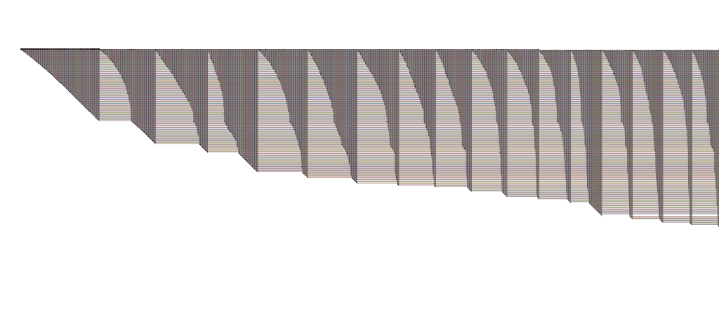
BioFabric Stanford Web Network
Click on image to enlarge
It's another example from the Stanford Large Network Dataset Collection.  This time, it's the Stanford Web Graph.  It's pretty much what you would expect: to quote the source, "nodes represent pages from Stanford University (stanford.edu) and directed edges represent hyperlinks between them."

But the interesting thing about the network above is that it contains 281,903 nodes and 2,312,497 edges.

And it kind of blows my mind that I feel that by looking at this, I can actually start to get some inklings about what is going on (YMMV).  At a minimum, I certainly know what I want to zoom in on and start to explore; there are all sorts of interesting structures in there to poke around and look at.  And the sequential nature of the BioFabric approach means I can easily do this in a methodical fashion. With hairballs containing 2.3 million edges, it seems kinda hopeless (for me, at least) without first hacking most of the network away.

Clicking on the image above to get a "larger version" is kind of a cruel joke.  Over at the Gallery, you can grab a 11,075 x 1,350 1.6 MB PNG with insanely inadequate resolution, or a much larger 31,173 x 3,800 13.0 MB PNG that is just ludicrously, stupendously inadequate.  They both look pretty bad... there is lots of room for improvement in rendering when links are this dense.  Of course, if you were trying to print this network out on paper, with one line per millimeter, the paper would be 2.3 kilometers long, and 282 meters high.

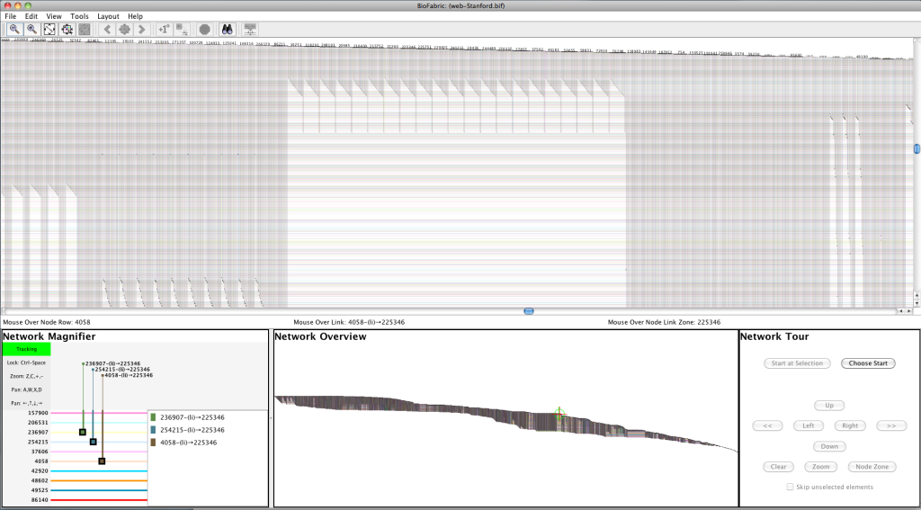
This is, of course, where the interactive BioFabric tool is supposed to come in! You can scroll around, zoom in and out, and explore a network in great detail.  After all, nobody thinks twice anymore about zooming in to look at cars and houses all over the entire world in Google Maps, right?  But, I am embarrassed to admit, this is why I referred to The Outer Limits at the start of the post... I can't do that yet at this scale. The nodes as lines technique scales wonderfully, but my implementation in software is not there yet. Version 1.0.0 is, after all, built as a proof-of-concept. Using the 4GB large memory version available on from the web site, I was able to get the network loaded, laid out, and exported to PNG, but the program was so sluggish as to be unusable as an interactive tool. Navigation was almost impossible. And when I tried to lay out the network using my similarity algorithm, the 4GB was not up to the task: I got an "out of memory" error after it ran for a few hours. So now I have a test case to use for working on the program's scalability.  But by using Jedi navigation tricks (hint: you can get a maximum zoom to the location under the mouse by pressing Ctrl-1 [that's one, not L], then zoom back out a bit), I did get a screen shot to show a detail:

BioFabric Stanford Web Network: Detail Screenshot
Click on image to enlarge

So these problems are the reason why I did not post a .bif file to the Gallery; it would be too painful.  Additionally, it would be really big: since that format is XML (more lack of scalability!), the file is about 750MB uncompressed, and 70MB in a ZIP.  If you insist, you can go get the original file from the source and create your own .sif import by deleting a few lines at the start and using awk to format it. You can get it to import if you let it run overnight, but it's just too embarrassing right now for me to make it too easy to do this.

One last point: I really found it frustrating that the data set is anonymized!  When you can actually see all sorts of interesting patterns in the network (why are there 21 pages with what looks to be essentially identical sets of links, as shown above?) you kinda want to try to figure out why that is.

So, truth be told, this network mostly serves to give an idea of the challenges ahead for BioFabric. But I'm looking forward to the day when I can easily explore this network (and larger) in depth: the picture at the top is The Shape of Things to Come!

Thursday, February 21, 2013

BioFabric Phrenology

The previous post of the small network from Les Miserables hopefully helped to get people more comfortable with thinking about nodes as horizontal lines. Keep exploring it until the concept starts to become second nature! But today's example is more typical of the types of networks BioFabric has to deal with. It is an example from the Stanford Large Network Dataset Collection: Wikipedia voting patterns. This network is available here, and is a directed graph weighing in at 7115 nodes and 103689 edges. To quote the page, "Nodes in the network represent wikipedia users and a directed edge from node i to node j represents that user i voted on user j."  Here it is, in the typical BioFabric high-aspect ratio presentation:


BioFabric Network Visualization
Click on image to enlarge

Click on the image above to get a somewhat larger version (1024 x 82 pixels).  Like the Les Miserables example, it is posted in the BioFabric Gallery, where you can get a 4 MB 10300 x 826 pixel PNG (which is actually still pretty low resolution) , as well as a 3.1 MB ZIP archive of the .bif file.

When I first looked at this network, one interesting feature quickly popped out at me.  Looking about 75% of the way across on the top edge (going left to right), you can see a bump. This close-up detail of that part of the network shows it clearly:

BioFabric Network Visualization: BioFabric Phrenology!
Click on image to enlarge

This marks the end of what I'll call the "first neighbor bump".  These distinctive bumps along the top edge of the network (there are more to the right of the one shown above) are a feature of the default layout algorithm used to draw this network; this algorithm is described in the BioFabric paper. Briefly, this layout assigns node rows using a breadth-first search of the network, starting at the node with the highest degree, and visiting neighbors in order from highest degree to lowest. Because we finish laying out the last lowest-degree neighbors of the starting node #1 just before we jump to start laying out the remaining unvisited high-degree neighbors of node #2, we typically get the bump shown above. So the prominent "edge wedge" just to the right of the discontinuity contains the previously untraversed edges incident on the first node that is two hops away from the start. (Keep in mind that edges incident on this first two-hop node that connect to nodes one hop from the start were already traversed and laid out somewhere on the left.) So the nodes laid out above this node line are all only one hop away from the starting node; the nodes laid out on or below this node line are at least two hops from the start.  This also means that the edges to the left of the discontinuity are originating either from the starting node, or one of the first neighbors.

So this is what popped out at me: the starting node and its first neighbors represent about 10% of the nodes in the network (which I can eyeball by comparing the height of this first bump to the total height of the network).  Yet the edges incident on these nodes account for about 75% of the total edges in the network (based on the placement of the end of this "first neighbor bump")!  An important fact about this large network with over 100000 edges comes almost for free.

I find these bumps help me to navigate and think about the network, and the fact that everything is laid out on a regular grid means that these features can help you to quickly estimate percentages as well.  So start to get tuned in to interpreting the bumps on the top of the network: "BioFabric phrenology"!